Jump
Executive Summary:
Orchestrating design across 5 teams in the rebuild of a core enterprise finance platform for the Royal Bank of Canada. The resulting solution saves 1,500 employee hours per month through automation and operational efficiency. The foundation is being scaled across 3 additional business units, driving continued process optimization throughout RBC’s Capital Markets organization.

Using Data Visualization to Expedite Complex Business Processes

I am a Senior Product Design Manager with RSM, a global financial services and banking technology firm. In this player-coach role, I orchestrate program-wide design of the Royal Bank of Canada's Securitization Finance Platform. RBC operates one of the largest securitization finance businesses in the world, with hundreds of banking associates using the platform. The initiative spans five agile squads, each with more than 20 members.
18 months into the project, the platform now automates core forecasting workflows, reducing forecast-building time by 60% and saving 1,500 employee hours per month. I shaped this outcome by uncovering key adoption drivers and using those insights to design 15 customizable data visualizations that automate time-consuming data aggregation processes previously required to run forecasts.
I manage a team of 5 designers and provide design oversight across 100+ cross-functional contributors, serving as the connective tissue that ensures a consistent design approach throughout multiple teams. I further extend my impact by mentoring designers to elevate both team performance and individual growth.

Business Context

The primary objective of RBC’s Securitization Finance team is to provide lines of credit that large corporations use to finance their operations. To fund withdrawals on these lines of credit, RBC issues securities. There are many complex and interwoven business processes involved in these activities. I've been focused on two of them, which are:
  • New Credit Line Origination: This process is handled by a Credit Line Originator who must forecast how much value each prospective credit line will bring to the business. To do so, they estimate revenue, risk, and other financial metrics based on external interest rates and historical asset performance benchmarks. Because these forecasts must fall within specific thresholds and receive committee approval, the Originator typically evaluates multiple pricing scenarios to identify the optimal formula, often relying on numerous permutations of data in the process.
  • Securities Redemption: RBC sells securities to investors and uses the upfront cash received to fund withdrawals on their clients’ credit lines. That cash must eventually be repaid. Each security has a designated 45-day window, occurring at some point in the future, during which the bank can repay (or “redeem”) the funds. However, securities cannot be redeemed at will within that window. The bank must maintain a required level of liquidity each day under federal regulation. Redeeming too many securities at once would require paying out large sums of cash and could push the bank’s liquidity below those required levels. Because of this, the timing and size of redemptions must be carefully forecasted by a Securities Manager to maintain sufficient liquidity.

Problem Statement

Users need access to dozens of data points to create their forecasts, yet RBC's current systems offer no way to access, view and summarize this data in one place. Users are forced to pull data from multiple systems, manually piecing together spreadsheets just to build a basic picture of performance. This fragmented workflow consumes excessive time, delayas credit approvals, and leads to lost high-value opportunities.
RBC needs their systems untangled, stripped of noise, and rebuilt to eliminate labor-intensive workarounds. Doing so is expected to generate an additional $200 million in annual revenue.

Users

Credit Line Originators and Securities Managers operate in high-stakes, data-intensive roles that demand speed and accuracy under constant pressure. While they recognize the need for better tools to improve efficiency, they fear that efforts to speed up their workflows could come at the expense of accuracy, and in their world, being wrong is not an option. Below is a summary of their key needs, preferences, and sources of stress.
  • Manual Work: Although the forecasts they produce are highly accurate, getting to that level of precision requires hours of manual effort and workarounds, especially when accessing up-to-the-minute data across disconnected systems.
  • High Stress Levels: In addition to racing against the clock to gather the data they need, users experience significant stress due to frequent ad hoc data requests from managers. These requests compound the pressure by adding unpredictable demands and frequent context switching.
  • Data Access and Control: Users want faster access to data but also the ability to control what they see, allowing them to manipulate data to generate insights.
  • Expert Level: Users are MS Excel experts, accustomed to working with large, condensed data tables. Their expectations for interaction and layout patterns are shaped by Excel, where dense information, customization, and direct manipulation are standard.
  • Technical Language: They frequently use terms like pivot tables, filtering, aggregation, and extraction. This is familiar language to them.
  • Customization: They desire shortcuts and the ability to save their preferences.
  • Compact Layouts: Users like dense layouts and say things like "get rid of the padding."
  • Small Browser Windows: Users work with multiple browser windows open side-by-side on a 4K monitor, running various applications simultaneously. Because they frequently switch between these apps, they rely on compact, scannable layouts to stay oriented as they jump back and forth.

Constraint: Design Process Under Pressure

When I joined the team, the project was behind schedule. RBC executives were expecting immediate progress and were pressing to begin development as soon as possible. This pressure accelerated design timelines, forced design work to move quickly in parallel across multiple teams and features, and threatened to sacrifice interaction with users.
I made two process changes to deal with these issues:
  • Bi-weekly user workshops: To protect the flow of user input, I established a flexible, bi-weekly workshop forum with RBC users where designers could drop in at any point in their process to conduct research, gather requirements, review designs, and collect feedback. It eliminated the overhead of formal scheduling and kept feedback flowing, but it did introduce some chaos. Input surfaced at different times, for different parts of the platform, and at varying levels of completeness. But rigid linearity was impractical at this pace, and this more adaptive model proved to be the right adjustment.
  • Daily design-team sharing sessions: The platform was being designed concurrently across 5 teams, 6 product areas, and 20 workflows. To maintain cohesiveness, I established daily sharing sessions. These meetings provided a structured way to exchange updates as designs evolved. They helped designers stay in sync, adjust quickly to new information, and maintain a unified direction despite the pace.
These cadences allowed us to continuously refine the experience based on real-world needs while still meeting design speed expectations. Over time, this ongoing contact built trust and strengthened relationships with users, preparing them for the workflow changes that would come once the new platform was available.
How the Design Process Played Out Across Several of My Focus Areas
Note: Feedback Cycle includes 1) Design Review with Design Team, 2) Review with Product Owner, 3) Workshop with RBC Users to solicit feedback, 4) Workshop with RBC Executive Stakeholders to solicit feedback and 5) design refinement based on feedback.
  • User Research: Task Analysis with Security Managers
  • Design: Security Redemption
  • Design: Redemption Simulator
  • Feedback Cycle: Run Workshops and Iterate
  • User Research: Task Analysis with Credit Line Originators
  • Design: Dashboard Scaffolding
  • Feedback Cycle: Run Workshops and Iterate
  • Engage w/ Dev: Early Session with Dev Leads
  • Design: Dashboard View Management
  • Feedback Cycle: Run Workshops and Iterate
  • Engage w/ Dev: Backlog Refinement with Dev Team
  • Design: Data Visualizations
  • Feedback Cycle: Run Workshops and Iterate
  • Engage w/ Dev: Backlog Refinement with Dev Team
  • Engage w/ Dev: UI Refinement Sessions with Developers
  • Validation: User Testing with RBC Users in a live environment
Because RBC operates in a high-pressure, compliance-driven environment where small errors can have serious consequences, stakeholders were reluctant to rely on user testing in simulated environments. Instead, they required all testing to be done with live builds and real data, so users could evaluate the system under realistic conditions. The workshops came in especially handy under this mandate, providing the infrastructure to gather feedback while development progressed toward a live build.

Three Lenses on Building the Platform

With this context in place, the rest of this case study continues through three design scenarios that explore a range of challenges I’ve encountered across the program. The first centers on solving an automation challenge while aligning with a complex stakeholder. The second highlights my work developing an AI-driven Business Intelligence layer to unlock deeper analytical insight. The third traces the platform’s evolution and shows how iterative research and continual feedback from business users shaped its direction. Following these scenarios, the case study concludes with an outcomes section detailing the measurable value created.

Design Scenario One: We Want to Make Every Decision

Key Findings that Shaped our Strategy

I started by conducting a task analysis observing 3 Securities Managers identify optimal redemption points for securities inside or approaching the 45-day window.
Their workflow proved highly inefficient, requiring slow, tedious navigation across multiple tools with no hinting of key data or proactive guidance, leading to time-consuming decisions and elevated risk of error. To complete a single decision, they triangulated information across 4 different screens with load times approaching 90 seconds each. When the data finally loaded, it displayed everything without prioritization, forcing users to repeat the same manual sorting and filtering steps each time.
They then had to draft an email from scratch to initiate the redemption process and manually insert 9 different transaction-specific data points, such as dollar amounts, names, and dates, into the message.
This work consumed roughly 8 hours per person each week. We were confident we could eliminate most of the manual overhead and improve decision-making speed by introducing automation and hinting-driven data visualizations that surfaced important signals at the right moment. Notably, the Securities Managers themselves were highly receptive to change. They openly acknowledged the inefficiencies and welcomed solutions that could improve their workflow.
Task Analysis Recap: Determining Optimal Security Redemption Points
Users:
3 x Securities Managers
Task:
Determine which securities to redeem and when, balancing upcoming maturities with daily liquidity requirements so the bank can repay investors without falling below federally mandated cash levels.
Activities Observed:
  • Fetch hundreds of securities and manually sort by days remaining to maturity.
  • Manually hunt for candidates to redeem; usually 10 to 20, with no visual guidance.
  • Open a separate browser tab to view the calendar of scheduled redemptions.
  • Add redemption amounts across the next two weeks to see where capacity remains.
  • Open another tab to confirm each day will not push liquidity below required minimums.
  • After selecting dates, switch to email and compose a redemption request, re-entering all security details manually.
Findings:
  • Fragmented, slow-loading tools significantly delay time-critical redemption decisions and reduce overall throughput.
  • With no guidance or hinting, users must manually identify eligible securities, limiting decision speed, quality, and scale.
  • Frequent cross-checking of data across systems heightens the risk of error.
  • Manual re-entry of known information adds unnecessary lag and avoidable oversight.

A Revealing Conversation with Securities Leadership

Next, I met with the head of the Securities team, a seasoned leader with two decades of experience running this operation. I walked him through what I had observed: a workflow held together by fragmented information and endless cross-checking.
When I suggested that targeted automation and hinting-driven data visualizations could ease the burden on his team, the conversation turned tense. He pushed back sharply, making it clear that he did not want the system “making decisions for us.” Though my intent was to speed up decisions by better surfacing critical information, not to replace human judgment, his reaction revealed a deep sensitivity to perceived loss of control.
I understood where his fears were coming from. In this high-stakes business context, a system that makes decisions on behalf of users could create significant risk and add new friction, since every recommendation would need to be verified, justified, and often reverse-engineered. That would undermine the speed gains we were trying to unlock.
Instead, we believed the real value was helping users move faster by surfacing critical data at the right moments. This forward-reasoning approach keeps experts in control while enabling them to process more information more quickly, ultimately leading to stronger decisions with less effort.

Easing the Pain Without Triggering the Fear

The urgency to deliver immediate value required me to jump straight into high-fidelity design using RBC’s MUI-based enterprise design system. I anchored my design around two core UI technologies already in RBC's engineering toolkit: AG Grid for high-density tabular exploration and eCharts for fast, flexible data visualization. Designing directly with these libraries allowed me to move quickly while ensuring the solutions were realistic for engineers to build.
I spent the next few days refining the visual foundation, experimenting with styling from RBC’s design system and layering it onto AG Grid tables and eCharts visualizations to ensure these separate libraries felt cohesive.
From there, I began shaping a dashboard that consolidated information users had been manually piecing together across several screens. Because they evaluate redemption opportunities in ten-day increments, I included a ten-day maturity forecast displaying scheduled redemptions alongside projected daily liquidity reserves, eliminating the painful cross-checking that once took place across multiple tools.
Now, at a glance, users could see which securities were approaching or already inside the 45-day window and quickly assess which days had capacity for additional payout while cross-checking daily liquidity requirements.

Winning Trust, Then Raising the Bar

With these screens completed, I was ready to initiate the feedback cycle, which includes: 1) design review with the design team, 2) review with the Product Owner, 3) workshop with RBC users to solicit feedback, 4) workshop with RBC Executive Stakeholders to solicit feedback and 5) design refinement based on the insights collected.
The design landed well with the design and product team. They felt confident that users would move faster without sacrificing decision control. We spoke in length about the scalability of the table and charts as they would become the foundation for the platform's data visualization system.
I combined the workshops with everyday users and executives to bring their motivations into the same conversation. Users were looking for relief from manual effort, while leadership wanted to ensure that decision-making authority remained intact alongside gains in speed and efficiency. Seeing the design together helped align those priorities, and there was consensus that it would materially improve workflow speed and better support decision-making.
With that momentum, I opened a discussion on deeper decision-support and targeted automation that would not make decisions for users, but would surface valuable signals and eliminate manual calculation.
I proposed two enhancements:
  • A simulation option that allows users to choose one or more securities and instantly see how redeeming them would affect daily redemption totals and liquidity, with clear alerts when limits are exceeded.
  • An option that lets users select securities for redemption, which then generates the transaction email automatically and prepopulates all required amounts, dates, and security names.
The head of the Securities team quickly interjected on the point about threshold alerts. He explained that there are no hard limits; redemption decisions weigh multiple factors, and the team may choose to cross a threshold if it benefits other metrics. The process is not an exact science, it is more of an art. I closed the discussion by committing that any further design exploration would respect this perspective.

Advancing the Concept

I added a way for users to select securities directly from the table and introduced buttons to run a simulation and auto-generate the necessary email. Running the simulation added potential payouts to the maturity forecast, giving users a faster way to validate their choices and relieving them of manual calculations.
To provide additional hinting without imposing a hard threshold, I added a 30-day average line to the maturity forecast. This acted as a soft reference point, helping users spot days that might be over-concentrated without acting as a strict deterrent.
This approach struck the right balance, delivering meaningful decision support while honoring the nuance raised by the department head. In a follow-up conversation, the team agreed. They were also enthusiastic about the auto-generated email workflow and expressed interest in extending that capability to other areas.
This became early proof of measurable value and reinforced that we were solving the right problems.

Design Scenario Two: 
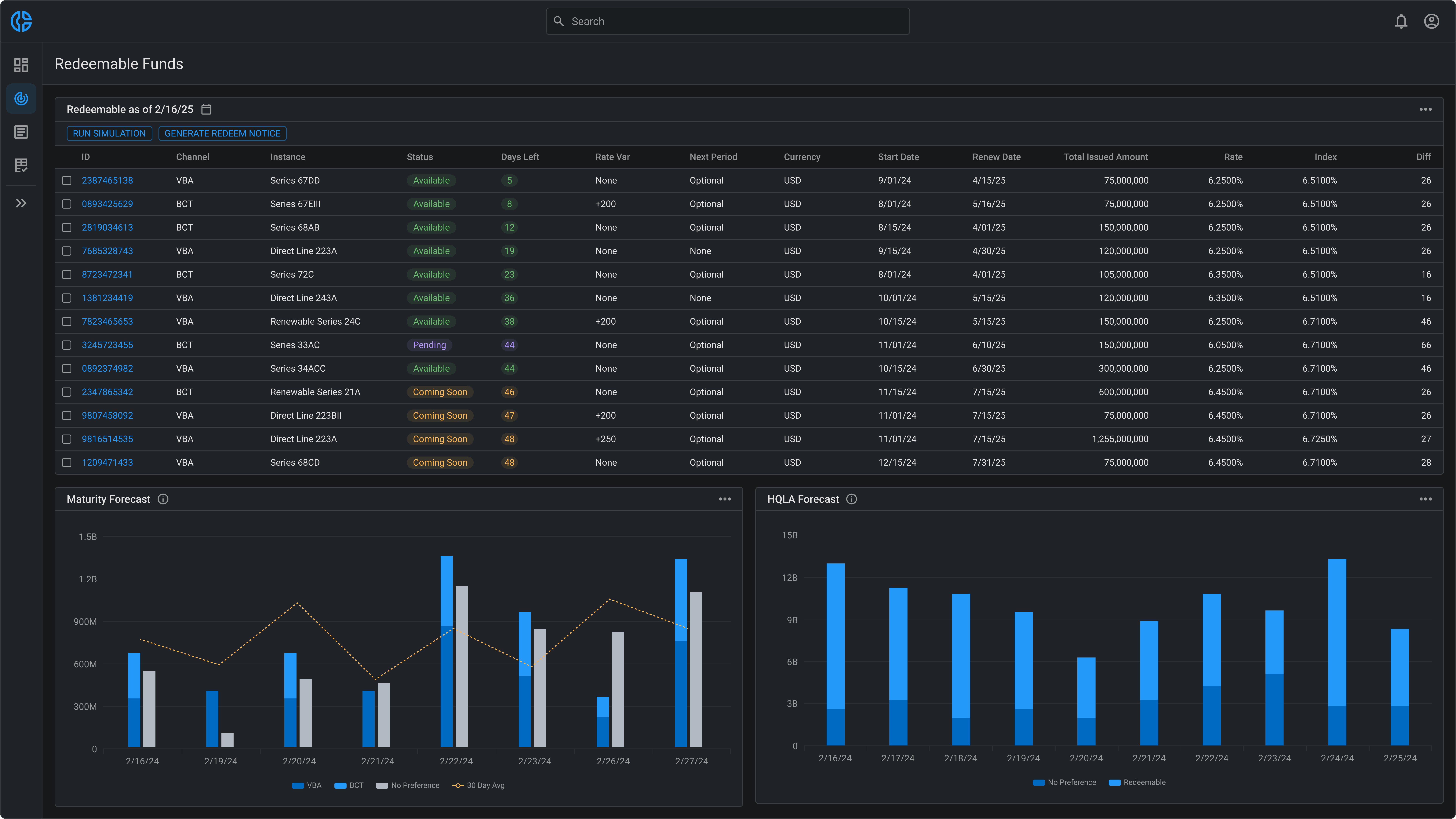
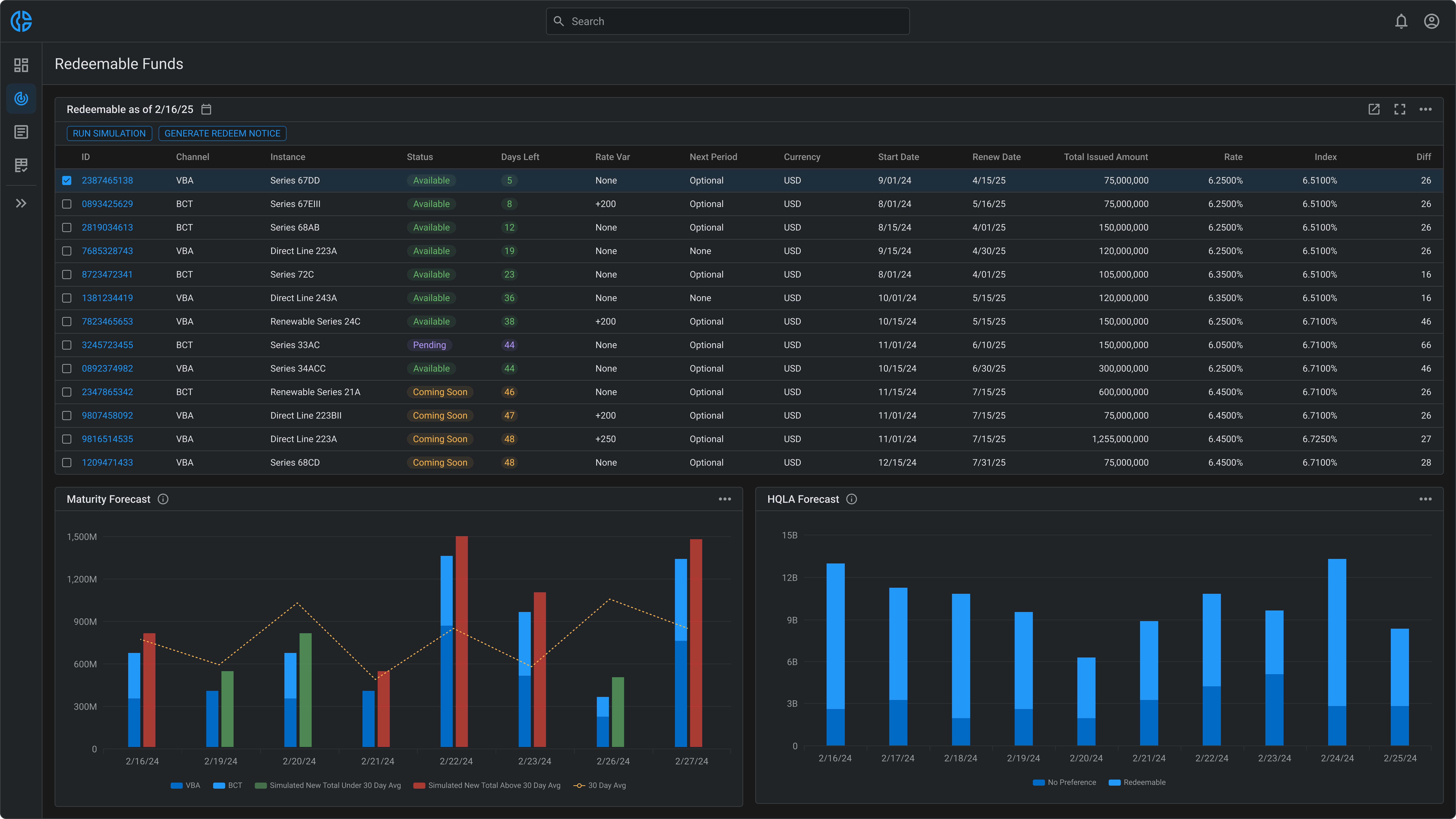
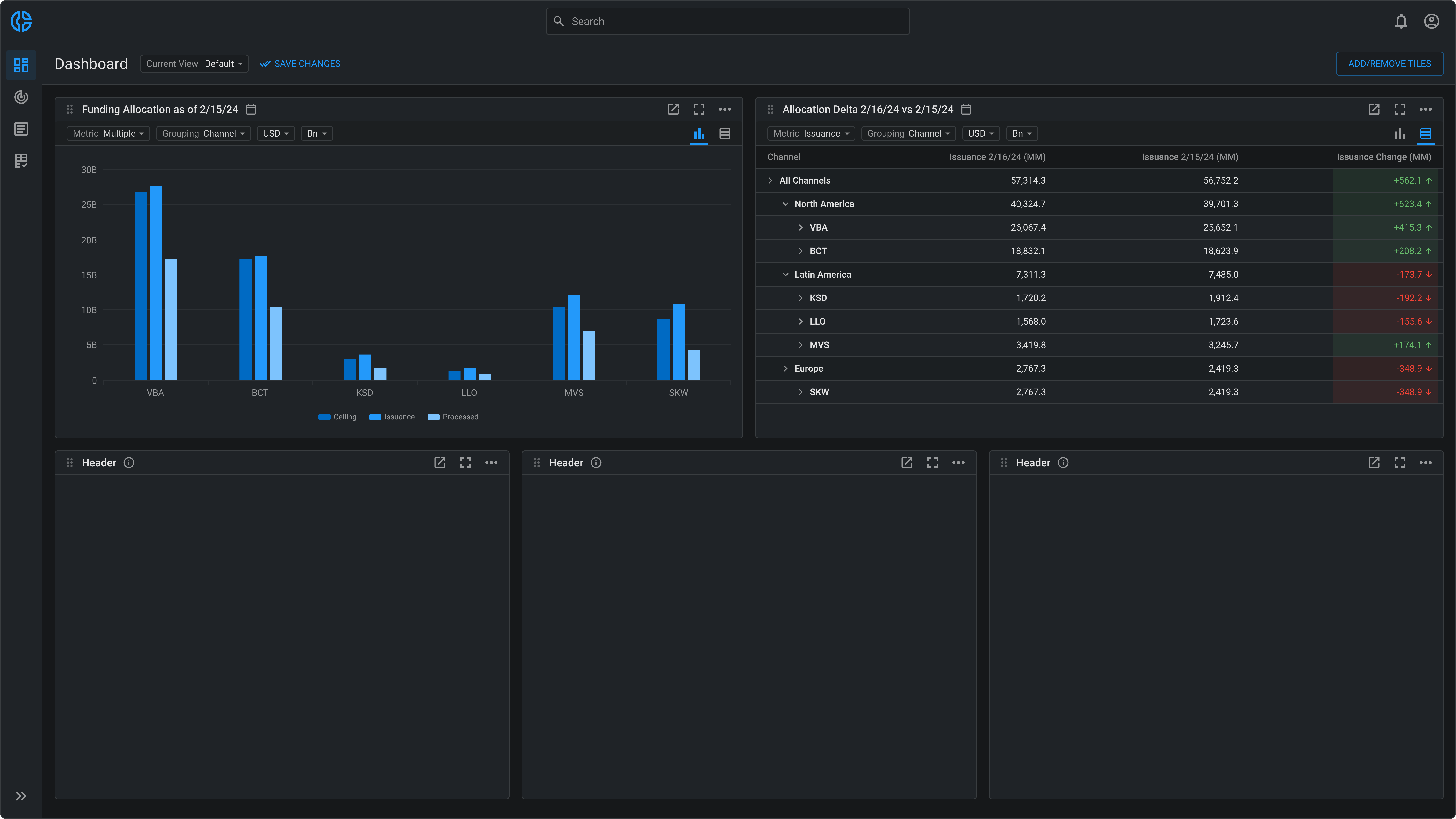
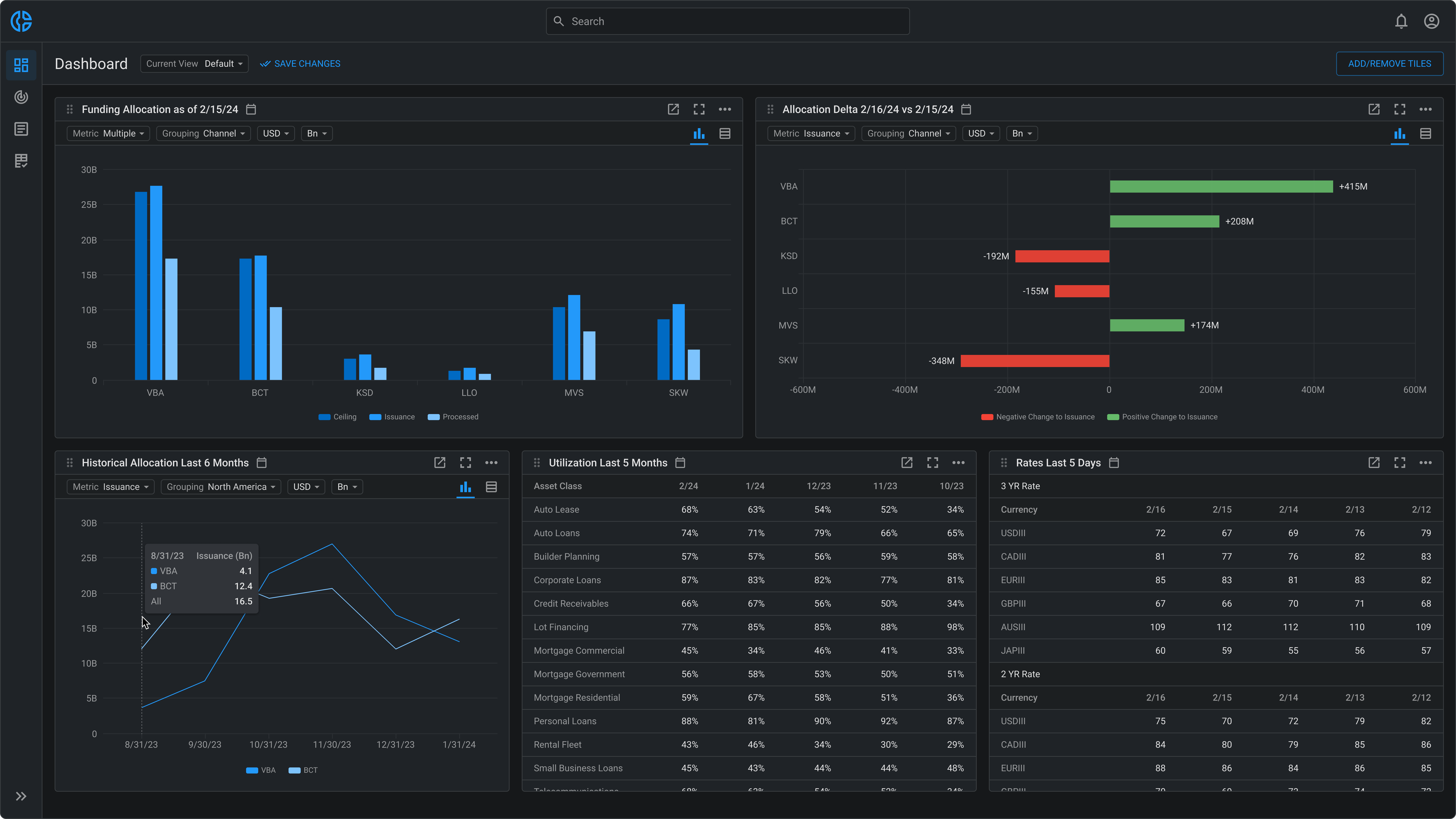
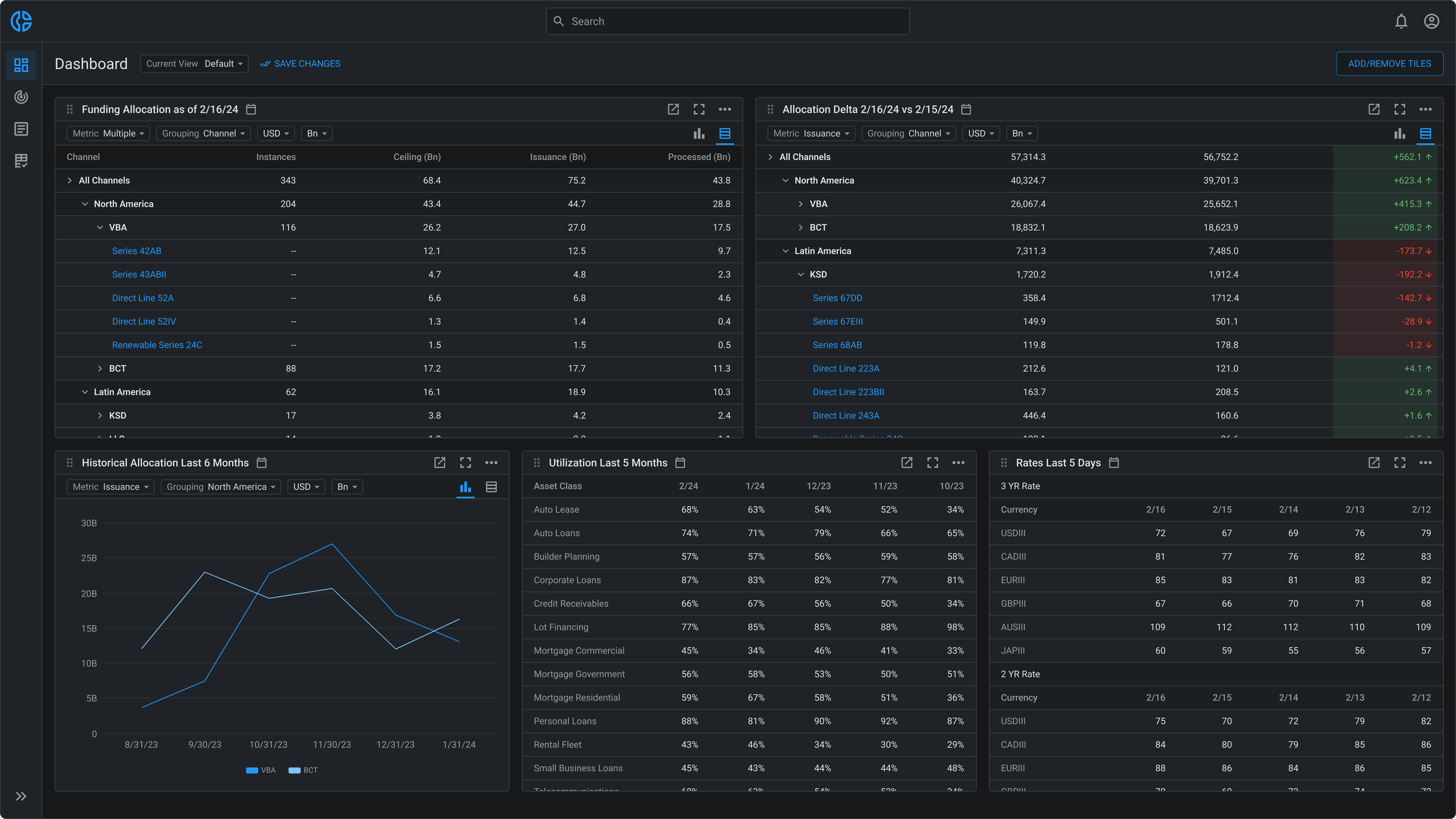
Expanding the Platform with AI-Driven Business Intelligence

A Quick Look Ahead

Before walking through the full evolution of the platform in the next scenario (Design Scenario Three), I want to briefly show how we’re unlocking additional value and deeper analytical insight for users by building an AI-driven Business Intelligence layer within the securitization ecosystem.
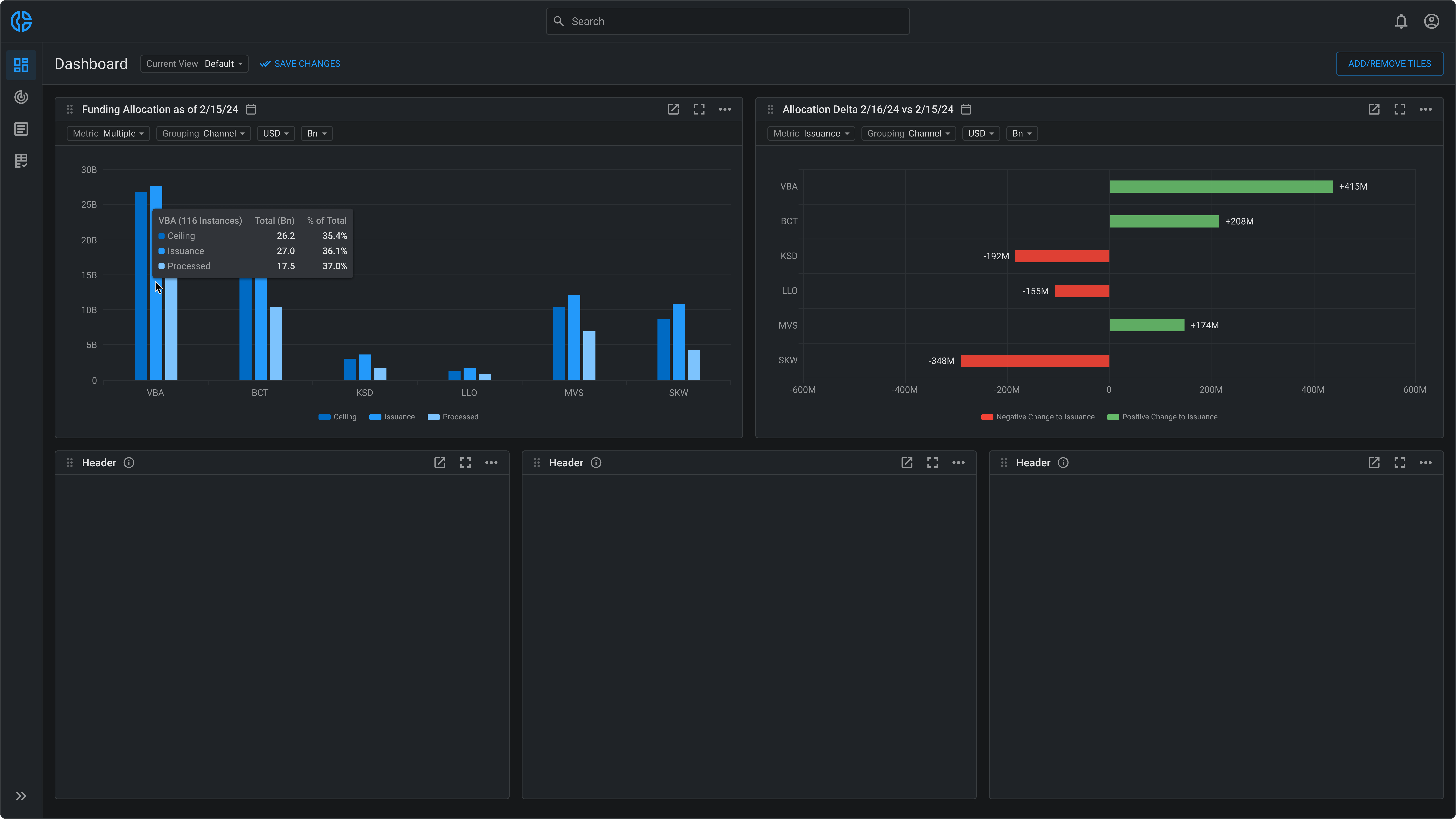
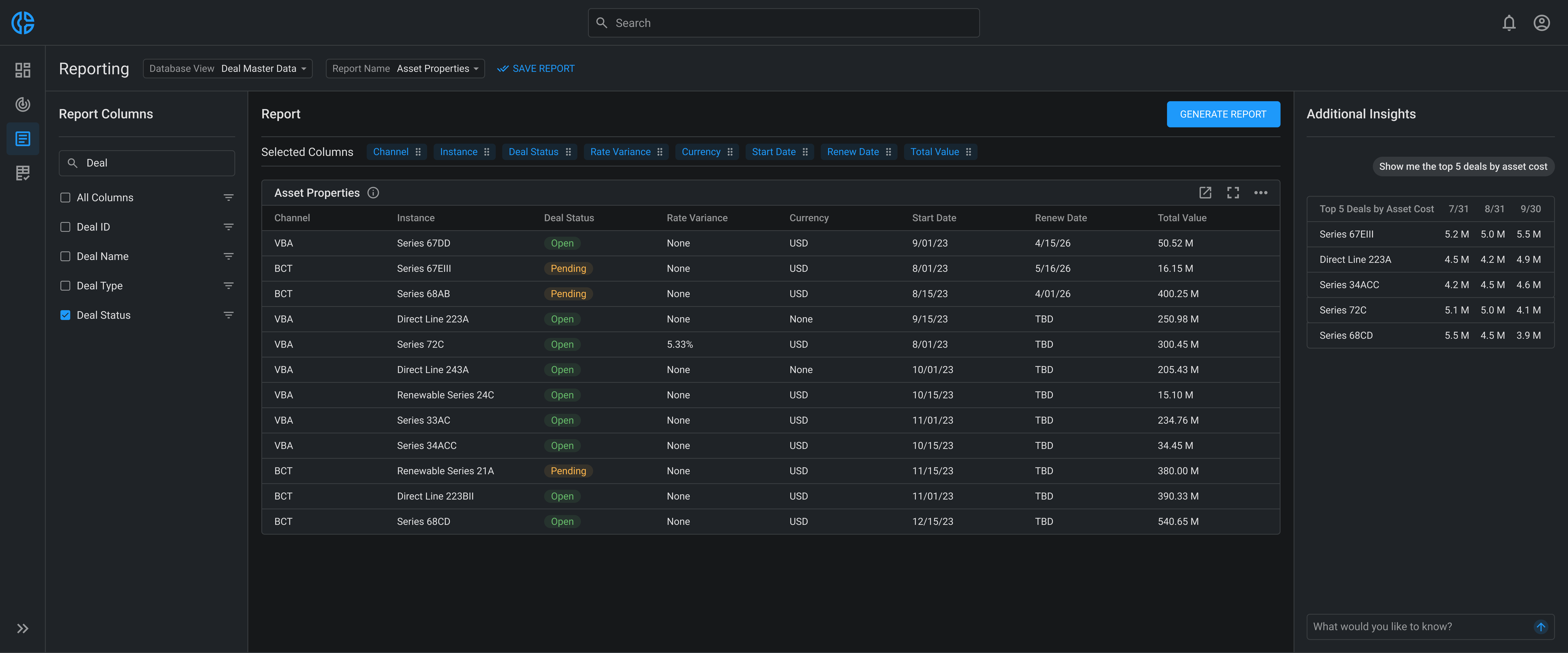
This capability enables users to select the specific data columns they want analyzed, auto-generate reports, and then use natural language to surface deeper insights. For example, users can ask, "Show me the top five deals by asset cost," or "Which originators had the highest variance in forecast accuracy last quarter?", and receive instant, actionable answers in both tabular and visual formats.
The interaction model blends structured querying with flexible, conversational exploration, bridging traditional BI workflows with large language model (LLM) capabilities to help teams without complicating their workflows.

Using Replit to Build Quickly

I partnered with a developer to build a working prototype in Replit. He used my Figma designs as a starting point while shaping the querying logic. From there, I refined the UI directly by prompting the AI, drawing on years of hands-on experience with front-end styling and pairing with developers to make real-time code adjustments.
The developer is continuing to build out the natural language query logic to support more complex prompts and edge cases.

Design Scenario Three: Expedite Workflow But Beware of Non-Negotiables

Key Findings that Shaped our Strategy

Building on the same user-research approach used with the Securities team, I ran a task analysis observing 6 Credit Line Originators as they forecast the value of prospective credit lines. I found that each user spent an average of 50 hours per month manually gathering data from at least 3 separate systems, then capturing the results into spreadsheets to summarize it. The constant toggling and manual copying of data added up to a grindingly slow process.
That alone was surprising, but the deeper insight was why users tolerated it. Despite the inefficiency, the process gave them full control over the data they accessed and how they presented it. That control was essential for producing accurate forecasts.
Users feared that efforts to speed up their workflows would take that control away, making it harder to fine-tune forecasts or respond precisely to urgent ad-hoc reporting requests, ultimately exposing them to blame if something went wrong.
The realization that speed becomes irrelevant if data access is constrained or if users cannot present data in their preferred format led us to shift our strategy from delivering a single, predefined dashboard to providing a more elaborate solution that enables users to build their own views. I defined two core priorities moving forward: flexibility to access a wide range of data permutations, and customization and control over data presentation.
Task Analysis Recap: Forecast Business Value from a Prospective Credit Line
Users:
6 x Credit Line Originators
Task:
Forecast the expected value of a prospective credit line by modeling revenue, risk, and other performance metrics across multiple pricing scenarios to determine whether it meets business and approval thresholds.
Activities Observed:
  • Manually collect data from various systems.
  • Enter data into custom-made Microsoft Excel dashboards.
  • Use Excel dashboards as input to run multiple forcasting formulas.
  • Fill out offline templates with results from forcasting exercise.
Findings:
  • Forecasting needs vary significantly from one credit line to the next, requiring access to diverse data sourced from at least 3 separate systems per forecast.
  • Each user spends an average of 50 hours monthly on manual data collection across multiple slow systems, and data entry into custom Excel dashboards.
  • Excel dashboards are created to summarize data for forecasting, but files are cognitively demanding and require deep familiarity to operate.
  • Despite the inefficiencies, users rely on this arduous, labor-intensive workflow because it gives them full control over the data they access and how they present it.
  • Users emphasized that any new solution must preserve the flexibility to access the data they need and control its presentation.
  • Users receive 4-5 urgent ad-hoc requests from management each month, consuming about 20 hours that would otherwise be allocated to forecasting.

Designing the Dashboard Scaffolding

The first screen I designed lets users select which data appears on their dashboard. It is shown when users first access the platform, and its settings can be modified at any time.
Next, I created the foundational structure for the dashboard, defining how data would be organized and how users could control and interact with it. Data visualizations were placed into flexible containers that users could move, resize, maximize to full screen, open in new tabs, or export for offline viewing.
I built the container component by combining smaller MUI elements such as cards, buttons, and menus, and structured it over an MUI grid that enables the dragging and resizing functionality.

Feedback from Frontline Users

With these screens completed, I was ready to initiate the feedback cycle. The first two reviews went smoothly, and overall, the consensus was that the design effectively laid the groundwork for users to control the data they access and how they present it. The PO was particularly encouraged, as the designs began to realize the larger product vision and provided tangible evidence to manage executive pressure for immediate results.
Things became more challenging during the workshop with 7 RBC users: 5 Originators and 2 Middle Office users who are responsible for managing credit lines once approved. I walked them through a scenario of a first-time user selecting data visualizations for their dashboard and customizing the layout.
The design and functionality were well-received, with little initial resistance. However, about 15 minutes into the session, the conversation shifted toward areas the design hadn’t yet addressed, particularly filtering capabilities, which are users’ primary tool for accessing multiple permutations of data efficiently.
One user asked directly, "How will filtering work?" I described my plan, which was to provide global filtering controls positioned above the dashboard, as is common practice. However, I underestimated the users' strong preference for compact layouts and robust functionality. They hinted that a global filter bar wouldn’t accommodate all scenarios, explaining situations in which applying the same filters to every visualization would be undesirable. Some visualizations, they emphasized, required entirely unique filters.

Strategic Risk Management from Executive Stakeholders

A few days later, the PO and I facilitated a similar workshop with several RBC Capital Markets executives, including the project sponsor. I walked them through the same “first-time” user scenario demonstrated in the previous session, and once again, the design and functionality were well-received. However, the sponsor raised an unexpected concern: “I love the control you’re providing. This is exactly what we want. But I don’t want the system to remember any filters or customizations unless I save.”
I was surprised, assuming an auto-save feature would be desirable, but the team presented a clear business case for requiring users to manually save their dashboard changes. The sponsor worried that if data was filtered, users might return later, forget their filters were active, and inadvertently share or report incomplete data—a risk with serious repercussions. She emphasized the importance of clearly labeled, manually saved dashboard views and requested the capability to maintain multiple dashboard configurations. These insights gave me much to consider in the next iteration.

Why My Next Iteration Didn’t Work

In response to this feedback, I designed a utility bar with filters on the left and a dropdown on the right for switching views, accompanied by an action menu. The action menu included options to save changes to the current dashboard view, duplicate views, create entirely new views, as well as manage the views, including setting a preferred view, editing view names, and deleting views.
Throughout the evening, I kept reflecting on the users’ feedback and decided that my latest design wasn’t going to work. The prominence of the new UI elements didn’t match what users expected, so I needed to rethink the layout. The next morning, I moved the dropdown next to the page title to keep it in the user’s direct line of sight and pulled the “Save” option out of the menu to give it greater visibility.
I then abandoned the global filter approach and placed a filter bar directly within the data visualization container component. This change reoriented my design approach toward a more compact structure that better supported the level of functionality users wanted. Both users and executives responded positively to the updated design, appreciating the improved discoverability and placement of the new elements.

Engaging with Development

Over the next two sprints, I fleshed out the various view-management flows. Together with the foundational structure, we had enough product intent defined to begin implementation.
The PO wrote the development stories and organized them into epics, which I reviewed to ensure alignment. Ahead of backlog refinement, I held a few sessions with the dev leads to preview the design and surface any early questions. The PO and I then led a series of backlog refinement sessions with the full dev team to thoroughly review the design and functionality, enabling them to estimate effort and plan the next several sprints.
Early on in development, we encountered a technical limitation with the initial grid component used behind the scenes for dragging and moving containers. The component allowed containers to swap positions only horizontally or vertically, but not both. As a result, the developers needed an additional sprint to find and implement a replacement that didn’t require extensive architectural changes.

Designing the Initial Data Visualizations

While the development team was building the foundational structure, I began designing the first two data visualizations. These visualizations summarize the performance data that Credit Line Originators need to forecast the potential business value of a prospective credit line. We conducted a couple of workshops with RBC users, who gave me a crash course on the data and its significance. After aligning conceptually on how to display the data, I proceeded to create the design.
The vertical bar chart shows how all existing credit lines are funded, including total amounts and amounts drawn. Users can view the data as of any date and apply up to 16 filters based on business parameters, allowing them to access the many permutations of data they need. This flexibility addresses a major user requirement and stands as one of the core tenets of the design.
The horizontal bar chart signals deltas across two dates for the selected metric, allowing users to compare day-over-day changes and see how the metric has increased or decreased across key business parameters.
These two charts alone provide immediate access to 60% of the data points needed to forecast prospective credit lines, significantly reducing time-consuming manual data collection and offline spreadsheet management. Once all planned data visualizations are designed and implemented, this design is expected to cover up to 95% of the required data points, effectively automating data aggregation for forecasting, and directly addressing the core business inefficiencies outlined at the start of this case study.

Point of Tension: Balancing Tricky Feedback to Avoid a Pivot

After reviewing with the design team and PO, we believed the design aligned well with our goals for user impact and business value, and everything seemed on track. We then sent a survey to 25 RBC users to gather feedback. While the majority were enthusiastic about the updates, the results revealed a more nuanced picture:
  • 84% said the layout was optimized for how they work, calling out the compact design and dense information structure as a strong fit for multitasking in multiple windows.
  • 92% said the ability to customize visualizations and save their preferences gave them the control they needed to explore data on their own terms.
  • 44% preferred viewing raw data in table format as opposed to charts, citing their ability to process large volumes of data more quickly in a familiar, Excel-like layout.
  • Only 12% were satisfied with the granularity of data, highlighting the need for deeper drill-down capabilities to investigate fluctuations beyond expected thresholds.
These themes were echoed in user comments. One user noted, “This is not as useful for me. I process data faster in table format, so I prefer viewing tables rather than charts."
The project sponsor expressed a need for precision, saying, “I love the charts for daily snapshots. They’re exactly what we need for monitoring performance. But I need a fast way to drill into unexpected fluctuations when something looks off.”
This feedback reinforced two things: first, the non-negotiables uncovered during the task analysis, namely that format is crucial and increased speed is irrelevant if users can't view data in the way they prefer. Second, that flexibility and control must accommodate a diverse set of preferences.
In response to these findings, I made a precise, strategic change without overhauling the design. I introduced a toggle within each container, allowing users to switch effortlessly between chart and table views. This gave users the expanded flexibility they needed while preserving the overall layout. Maximizing a container or opening it in a new tab became especially useful, providing more space for viewing large datasets in table format.
In the table view, users can expand rows to drill down into the credit lines associated with each funding channel and navigate to a screen displaying additional metrics for each line. To provide users with further configuration, the table component leverages advanced filtering, searching, and sorting from the AG Grid UI library. I also designed additional controls for adjusting row height, cell width, and column layout.
In the delta comparison table view, users can drill-down into an unexpected decrease (KSD in this example) and identify which credit lines are associated with the decrease.
Users found comfort in this solution, knowing they won't miss any data. They can view a summarized overview in chart format and switch to table view for detailed data consumption and drilling down into specifics.

A New Constraint Introduced by Competing Needs

Adding the chart-to-table toggle solved a critical user need, but it introduced a new layout challenge. If containers were resized to smaller widths, the toggle would compete for space with existing filter controls and clip the filters or push them out of view.
While this type of spatial conflict is common, the real challenge was finding a component in RBC’s design system that could handle horizontal overflow and reveal more options when needed. The team didn't have time to build something from scratch.
To solve this, I ran a paired working session with the developer to explore implementation options. We ended up modifying the carousel component from RBC's design system and restyling it to function as pagination arrows within the container’s sub-header.
We ensured the component appeared only when necessary and optimized the surrounding spacing. Together, we adjusted padding and margins to maintain a clean, compact layout that aligned with user expectations without sacrificing clarity or usability.

Structuring the Next Layer of Visualizations

In the next iteration, I designed the second row of charts and tables. I introduced a chart showing historical credit line data, enabling users to view performance benchmarks up to 24 months in the past. Alongside it, I added two tables: one displaying credit line utilization across various asset classes, and another showing external interest rates and currencies needed for forecasting. Users preferred the table format for utilization and rate data, finding a chart unnecessary for these metrics.
Here are the hover states for the delta chart and credit line history chart.
This is an example of a dashboard configured for users who prefer working with tables.

Minimizing the Gap Between Design and Implementation

My work doesn’t end at design handoff. In addition to refining the product strategically based on feedback and opportunities to create value, I ensure that the shipped product accurately reflects the design vision by minimizing the gap between design and implementation.
A key part of my design process is collaborating closely with the development team to refine the implementation. During each sprint, rather than documenting UI and styling discrepancies for asynchronous fixes, I conduct working sessions where we review the code and address issues on the spot.
This hands-on approach allows us to set component parameters and styles together, and it gives me the opportunity to coach developers on accurately implementing the design. These sessions also provide a forum to negotiate practical solutions whenever we encounter technical or timeline limitations. Ultimately, each 1 hour working session saves 4 hours of development time, so by holding 3 sessions each sprint, we free up around 12 hours of dev capacity every two weeks.
These working sessions were especially crucial during the implementation of the foundational structure and initial data visualizations. I needed to get the implementation right from the start so we could quickly scale the solution to address more business process challenges. It also gave me an opportunity to build strong relationships with the front-end devs on the team, setting the stage for a long road of close collaboration ahead.

User Testing in a Live Environment

Across the project, we’ve completed 10 rounds of user testing with 30 participants, each performing 3–5 test scenarios. Specifically for this design, we ran 3 rounds of testing, resulting in the following insights, which I've addressed in subsequent iterations.
  • Forecast Completion: 90% of users confirmed they can complete their forecasting workflows effectively using the new system. The remaining 10% noted they would still need data from an additional system to fully complete their process.
  • Spreadsheet Reduction: 95% of users indicated they would stop creating their own spreadsheets and instead rely on data directly from the system.
  • Additional Data Points: Users were pleased by the quick accessibility of key data points and recommended incorporating 14 additional data points into the visualizations to further enhance decision-making.
  • New Ideas: Users identified 5 additional business processes that could benefit from automation, providing valuable use cases for future enhancements.
  • Time Stamps: Users were confused about whether they were viewing the most current data, as different metrics are refreshed on different schedules, making it difficult to know when each visualization was last updated.
  • Business Terminology: Users highlighted variations in how different business units refer to key metrics, indicating the need to normalize terminology to ensure clarity and universal understanding across teams.
  • Loading States: Users identified 5 scenarios where slow response times impacted visualization performance and 3 scenarios where loading indicators were missing.
  • Filtering Interaction: When filtering large data sets, users found the immediate refresh after each filter selection cumbersome, as data was still loading while setting subsequent filters, leading to confusion about whether filters were applied correctly.
  • Highlighting Data: With comprehensive data now readily available, users articulated specific needs for highlighting critical information, such as totals, subtotals, sums, and averages, to enable quicker insights.

Outcome

As a direct result of this design, the platform now automates forecasting workflows for hundreds of banking associates, reducing forecast-building time by 60% and saving 1,500 employee hours each month.
The solution delivers immediate access to 95% of the data points needed for forecasting prospective credit lines, eliminating the need for time-intensive manual data collection and offline spreadsheet processes.
This outcome paves the way for a 20% increase in credit line approval throughput, potentially generating an additional $200 million in annual revenue.
RBC has since doubled down on this business process automation strategy, investing in the design and development of 6 new dashboards, using the same framework.
Thank you for reading.