Jump
Executive Summary:
Led design of a SaaS platform with advanced patient- and clinic-facing tooling at the 30-person healthcare startup Telmetrix. The resulting solution increased physical therapy engagement by 42%, leading to more patient appointments and higher clinic revenue. Pilot results validated product-market fit and set the stage for expanded clinical adoption.

Designing a Path to Better Quality of Life

As Founding Designer at the healthcare startup Telmetrix, I led the team in creating a SaaS platform focused on improving physical therapy engagement through movement tracking technology. The platform consisted of an integrated ecosystem combining a mobile app for exercise guidance with an analytics tool to automate clinic workflows.
During a clinic pilot program, patients using the platform showed a 42% increase in exercise engagement and a 55% reduction in appointment cancellations. I shaped this outcome by leading a 30-person cross-functional team through an iterative design process that included research, prototyping, and user testing to transform the product from an early version with severe blockers to adoption into a commercialized platform.

Problem Statement

The physical therapy industry is facing serious challenges. Insurance companies are reimbursing clinics less for their services, cutting into revenue. The loss in revenue has made it harder to offer competitive salaries, leading to staffing shortages, as physical therapists move to better-paying roles in other areas of healthcare. Those who remain are overwhelmed with paperwork and administrative tasks, leaving less time to focus on patient care and recovery.
To stay financially stable, clinics are turning to patient engagement as a way to drive revenue. When patients stay committed to their treatment plans, they attend more sessions, resulting in more billable visits, fewer cancellations, and better outcomes.
At the same time, clinics are investing in tools that automate daily workflows and reduce documentation burdens. By cutting down on administrative tasks, therapists can shorten appointment wait times, spend more time with patients, and improve the overall care experience, further boosting patient engagement.

The Users

Clinic managers, physical therapists, and patients are all operating under heavy pressure. While they are actively looking at technology to enhance their workflow, they are cautious about change. Every group weighs new technology against the risk of financial strain, burnout, frustration, and wasted effort. The following sections outline the key fears and decision factors influencing each group.
• Clinic Manager: Clinic managers are under constant pressure to strengthen revenue while navigating a challenging business environment. Despite their interest in technology solutions, they are wary of adopting software that could introduce more risk than reward. With limited resources, they worry that a wrong investment could drain time, money, and staff energy without delivering real results. Any platform they consider must clearly prove it can deliver measurable value to patient engagement, operations, and revenue.
• Physical Therapist (Clinician): Physical therapists are increasingly discouraged by the state of the industry. Many carry student debt, face rising living expenses, and work in stressful, understaffed environments where administrative tasks and packed schedules leave little time for patient care. While technology could help ease these pressures, therapists are skeptical of new software that often adds complexity instead of solving real problems. They need solutions that truly simplify daily tasks, support clinical decisions, and strengthen patient connections.
• Patient: Patients often approach physical therapy with hesitation. Many lead busy lives, balancing full-time jobs and family responsibilities, and are unsure how they will fit therapy into an already packed schedule. Others, particularly retirees, have more time but are frustrated by the lack of a clear path to recovery. Across both groups, there is often a lack of confidence in whether physical therapy will truly work, and uncertainty about when, or if, their pain will improve. This makes it easy for patients to lose motivation and abandon their programs if the value of therapy does not clearly outweigh the time and effort required. For older patients, concerns about navigating new technology can add another barrier to engagement.

Point of Tension

Reframing a Misguided Product

Before I joined the team, a version of the exercise guidance app had been built using motion detection and computer vision. The team believed it was generally well positioned and ready to begin adding new features, even though it was developed without any design input.
On my first day, the CEO asked me to review the app, and it was immediately clear that the experience was fundamentally broken. Users were given no instruction on how to begin the exercise, including essential steps like calibration, leaving them unsure how to proceed. While the underlying technology worked, the usability was so poor that the overall product direction needed to be fundamentally reassessed.
I now faced the challenge of pragmatically assessing the situation and diplomatically communicating the concerns, while rallying the team around a design process to produce a product positioned for real-world adoption.

Where the Experience Fell Apart

As part of my review, I opened the app and began a neck extension exercise. The experience was immediately disorienting. I selected the exercise from a list, and the app abruptly switched into camera mode. Then, nothing. No prompt, no instruction—just my face on the screen and a thin bar hovering below my chin.
With no guidance on what to do next, I tried different head movements to see if anything would happen. Eventually, when I lowered my chin, the bar disappeared. There was no indication I had done anything correctly, so it wasn’t clear whether I had started the exercise or triggered a mistake. That first motion, I later learned, was a calibration step to align with the device’s sensors. But there was no explanation, no visual cue. Once calibration completed, my next movement triggered the first official rep. But how would a user know that? The system offered no guidance, no feedback, no sense of progress or even purpose. For a product built around movement, the silence was deafening. This wasn’t just a poor user experience. It was a fundamental blocker to adoption.
Visually, the experience was equally underdeveloped. The interface lacked any recognizable identity. It was gray, generic, and disconnected from both healthcare and fitness design conventions. While visual identity may not be critical on day one, the longer we build without it, the more tech debt we accumulate. As time goes on, it becomes exponentially harder to retrofit a cohesive experience onto an incoherent foundation. Establishing a visual identity now would also give the team, clinics, and investors something to rally behind beyond the technology itself.

De-Risking Through Design

My goal wasn’t to assign blame; it was to de-risk the company by helping the team see how these flaws will derail adoption. I framed the usability concerns as critical risks: if users couldn’t figure out how to complete their first exercise, they would abandon the app within minutes, and clinics wouldn’t sign on for a pilot.
Instead of delivering a critique, I proposed a clear path forward: user testing the current app as an immediate first step, and a design process to evolve it into a product users could intuitively understand. This approach would not only validate the issues I surfaced, but also demonstrate that I had a plan for solving them. I wanted the executive team to feel we were in control of the solution, even if it meant rethinking our direction.
Design Process
I ran fast-paced iteration cycles, testing with users every other sprint. Features advanced to development only after 90% of users rated all tasks 5 out of 5 for ease of use.
Creation Sprint:
• Design
• Prototype
• Collect Internal Feedback
• Design Iteration
• Update Design System
Testing Sprint:
• Create Test Script
• Run User Tests
• Analyze Feedback
• Report Out Findings
• Design Iteration

Corroborating Findings

To test the current version of the app, I partnered with a seasoned physical therapy clinician who had recently joined the team to advise on clinic operations and patient care. He leveraged his network to recruit a group of 4 practicing clinicians and 4 patients, allowing us to test the app in realistic conditions.
The testing results revealed that:
• Only 1 out of 8 users completed a full exercise, and it took nearly 10 minutes, which was twice the expected time.
• The average ease-of-use rating was 1 out of 5. Most users got stuck early in the flow, with no clear instruction on how to start the exercise or record a rep.
• 7 of 8 users said the app did not increase their motivation to follow a physical therapy program. Several noted that the lack of guidance and unclear value made them more skeptical about sticking with therapy.
It was clear that adoption depends not only on ease of use, but also on how effectively the product communicates its value. Patients need to believe it will help them recover, feel confident they can stick with the program, and stay motivated throughout the process. This insight had not been fully anticipated, yet it emerged as a fundamental realization that would shape the product going forward.
This clarity aligned the team around the need to rework the product experience to position it for adoption, rather than continuing to build on top of a foundation that was not yet ready to support real-world use.
User Testing Plan
Application:
Current mobile app for patient exercise guidance
Users:
4 practicing clinicians and 4 patients
Tasks:
• Navigate through the exercise plan to select the first exercise.
• Complete a neck extension exercise, including any calibration or setup steps required.
• Interpret any feedback or progress indicators provided after completing the exercise.
• Explain what the app is tracking and how it supports recovery.
Key Questions:
Were you able to complete the exercise without assistance? If not, where did you get stuck?
On a scale of 1 to 5, how easy or difficult was it to use the app to complete the exercise? Why?
Did you feel confident that the app correctly tracked and recorded your exercise? Why or why
not?
Based on this experience, how motivated would you feel to continue using the app as part of your physical therapy program?
What do you think the app is trying to help you achieve, and do you believe it can help you get there?

Design Scenario: Shifting to Clinic Tooling

Why Clinic Tooling Came First

The team had aligned on rethinking the patient experience, with the understanding that it would take time to implement. But with growing pressure to secure a clinic pilot, the executive team shifted near-term focus to clinic-facing tooling that could immediately deliver measurable operational improvements by simplifying daily workflows and reducing documentation time. Compared to the patient-facing portion of the platform, it was faster to implement and less dependent on patient behavior, making it a lower-risk entry point for clinics.

Grounding the Solution in Workflow Reality

I began by mapping the end-to-end clinical journey to identify the most promising areas for automation. This allowed us to break down each step, from treatment planning to session notes to follow-up tracking, and pinpoint where design could reduce effort without disrupting clinical routines. The journey map also helped align the team around shared terminology and priorities before moving into detailed solution design.
To build the journey map, I ran working sessions with the CEO, Clinical Advisor, Product Owner, and Dev Lead. We began with the initial office visit, followed the patient through their first at-home session using the remote exercise app, and traced how the therapist would monitor progress and adjust care over time. This helped clarify where automation could ease therapist workload.
The key points from the journey map were:
• In-person visit cadence: The patient would continue attending weekly in-person physical therapy sessions, forming the foundation of their treatment plan.
• Home exercise support: The mobile app would reinforce proper form, track reps, prompt pain reporting, and through a positive experience, keep patients engaged between sessions, helping ensure they remain committed to the program and continue attending in-person visits.
• Time savings during the initial assessment: Therapists could build the home exercise plan in-session using optimized tooling, saving 10-15 minutes that could be reallocated to hands-on care and patient interaction.
• Time savings during follow-up visits: Remote exercise data captured throughout the week would give therapists a clear picture of progress before each appointment. This would save 10-15 minutes typically spent getting up to speed during the visit and another 10-15 minutes on documentation required for insurance, reducing end-of-day administrative work by up to an hour. That recovered time could again be reallocated to patient interaction, strengthening engagement.

Clarifying What Matters to Clinicians

We determined that a clinician-facing dashboard would be the right vehicle for surfacing remote exercise data, so we started there. I worked with the team to craft a survey to help us identify what information clinicians needed most, and we sent it to 25 practicing therapists recruited by our Clinic Advisor.
The results highlighted three priority data points to show at a glance:
• Engagement: Did the patient exercise today?
• Adherence: How much of the patient's assigned program was completed today?
• Pain: What was the patient’s reported pain level today?
Two additional metrics, movement quality and patient comments, were set aside for a later phase to help the team deliver the initial release more quickly.

Establishing a Visual Identity

While the survey was in the field, I led the design team through a two-week sprint to explore visual styling for the platform. We tested multiple typographic systems, color palettes, and illustration styles to find a balance between clinical professionalism and approachability. Working closely with the CEO, we ultimately landed on a direction that was inviting and appropriate for a healthcare setting, something that would feel credible to clinicians without overwhelming patients.

Designing the Dashboard

The design challenge was to present data from remote exercise sessions in a concise summary that a physical therapist could interpret in 30 seconds. The main section of the screen featured three charts visualizing the priority data points (Engagement, Adherence, and Pain), with a side panel showing a log of workout results. The layout emphasized quick scanning, minimal interaction, and immediate clinical value.
I also designed a landing screen that allowed clinicians to search for patients and view upcoming appointments. In addition to serving as a search tool, it provided a real-time overview of the clinic’s active patients, making it easy to monitor progress, identify who needed attention, and stay ahead of the day’s schedule.

Findings that Further Shaped the Design

I sent a prototype of these screens, along with a follow-up survey, to the same group of 25 clinicians. The results reinforced the design direction:
• 92% said the dashboard gave them a clear picture of patient progress.
• 88% said it would help them run in-person sessions more efficiently, saving time that could be reallocated to patient care.
80% said the layout and visibility into daily adherence would help them catch issues early and personalize care more effectively.
One clinician noted, “This makes it so much easier to get a quick sense of how someone’s doing. I can walk into the room already knowing what to focus on and move the session forward faster.”
However, feedback also showed that the dashboard as presented wasn’t enough to drive adoption. 72% of clinicians said they needed more insight into which exercises patients were having difficulty with, along with recommendations on when to intervene.
While the initial version focused on immediate automation wins, this feedback shaped the next phase around more proactive, decision-support capabilities.

What This Work Unlocked

This early focus on clinic-facing tooling gave us a clear path to deliver immediate value while surfacing critical requirements for long-term adoption. The dashboard validated core automation opportunities, clarified what data clinicians needed most, and positioned the product for deeper decision-support capabilities in future iterations.

Design Scenario: Building the Plan, Engaging the Patient

Expanding Efficiency Gains

To drive further time savings for clinics, we targeted inefficiencies in the exercise plan creation process during in-person sessions. Therapists had to leave the patient mid-visit, return to their workstation, use slow, non-optimized software to build the plan, print it out, then come back to explain it, answer questions, and make revisions. This asynchronous process pulled focus away from the patient and reduced the time available for quality interaction.
In response, we designed a Plan Builder that allowed therapists to create and adjust the plan in real time, directly alongside the patient. This streamlined the session, saved up to 15 minutes for hands-on care, and also created a valuable entry point into the tech experience by giving patients their first taste of a more engaging, interactive care journey as they watched their plan come to life.

Designing the Plan Builder

The design had to serve both the patient and the clinician in-session. It needed to be visually clear enough for a non-expert to follow along, while giving the clinician a fast, efficient way to search, select, and customize exercises.
To meet those needs, the exercise search panel sat at the top of the screen, allowing the clinician to quickly find movements by searching an individual exercise library or templates categorized by condition. Each exercise included a simple movement illustration that helped patients picture themselves performing the motion, building confidence in the process.
As selections were made, the plan assembled visibly on the right side of the screen, giving both the clinician and patient a shared view of the program taking shape.
Once selected, each exercise could be customized with adjustable sets and reps.

Testing Revealed a Bottleneck

To evaluate the Plan Builder, I conducted multiple rounds of unmoderated user testing through UserTesting.com. 10 of the 25 clinicians who had participated in the earlier survey were selected to participate. I wrote the test scripts and created the prototype.
While testers responded positively to the overall concept and layout, assigning sets and reps emerged as a major bottleneck. Clinicians had to adjust each field individually, slowing the process so only 30% could build a plan within the 5-minute target. One user noted, “This is taking way too long. I wouldn’t do all this while a patient is sitting there.”
Despite the need for iteration, testing surfaced several encouraging signs:
• 90% of testers said the layout was easy to follow.
• 80% said they would feel comfortable showing the screen to a patient during a session.
• 80% said seeing the plan build visually would engage the patient and boost confidence.
Another user said: “This is something I could show a patient without having to explain it line by line.” These findings made the next iteration clear: retain the visual clarity and structure, but remove friction in the interaction model to truly support in-session use.
User Testing Plan
Application:
Plan Builder Prototype
Users:
10 practicing clinicians
Tasks:
• Search for a specific exercise based on a patient condition.
• Add 3 exercises to a new plan using the exercise library.
• Adjust sets and reps for each selected exercise.
• Preview the assembled plan to confirm accuracy.
• Remove and replace one exercise before finalizing the plan.
Key Questions:
How did this flow compare to your current plan creation process?
Where, if at all, did the process slow you down?
Did anything feel unclear or unnecessary?
How comfortable would you feel using this tool in-session with a patient?
What, if anything, would you need to move faster?

Removing Barriers to Speed

To address the bottleneck uncovered in testing, I first partnered with the development team to integrate default values for sets and reps directly into the exercise library, eliminating the need for clinicians to enter them manually for each selection. Second, I redesigned the workflow so that editing parameters became optional rather than required. These changes allowed clinicians to move through plan creation much faster while still having the flexibility to make adjustments when needed.

What This Work Unlocked

The Plan Builder delivered a clear clinical workflow improvement by replacing a fragmented process and enabling therapists to create exercise plans in real time alongside the patient. Just as importantly, it laid the foundation for introducing patients to the platform through clinician-guided engagement, creating a stronger first impression and supporting long-term adoption.

Design Scenario: Refocusing on the In-Home Experience

Defining What the Experience Must Deliver

With validated clinic-facing solutions in development, the team shifted focus back to the patient experience. Clinics depend on patients consistently attending weekly in-person physical therapy sessions, which generate the billable visits needed to stay financially viable. But many patients stop showing up because they lose motivation at home and fall off their programs.
To keep patients engaged between visits, the product needed to do more than track movement. It had to effectively communicate its value. Patients had to believe it would help them recover, feel confident they could stick with the program, stay motivated throughout the process, and find its guidance on proper form genuinely useful.

How the Design Instilled Confidence

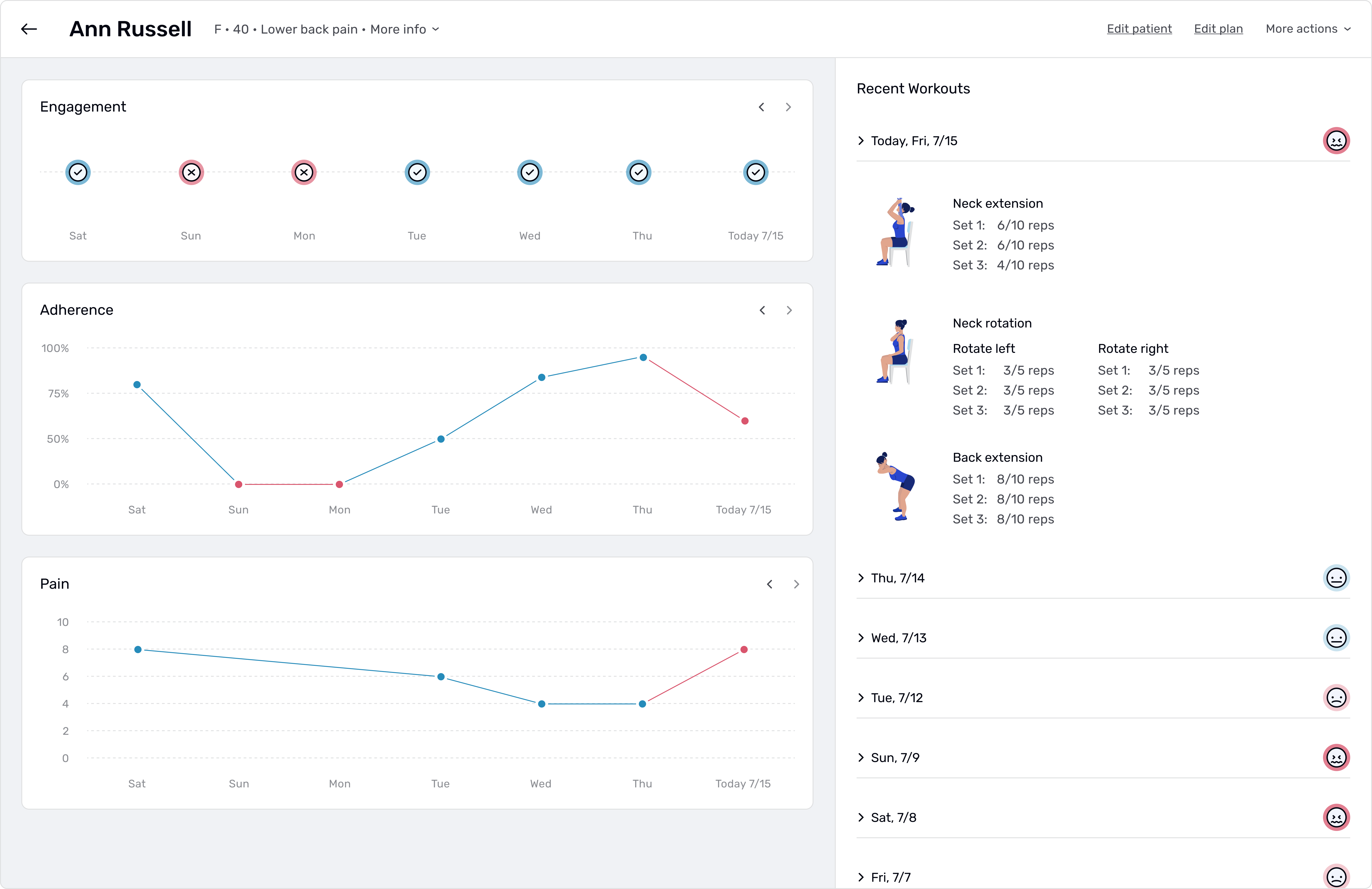
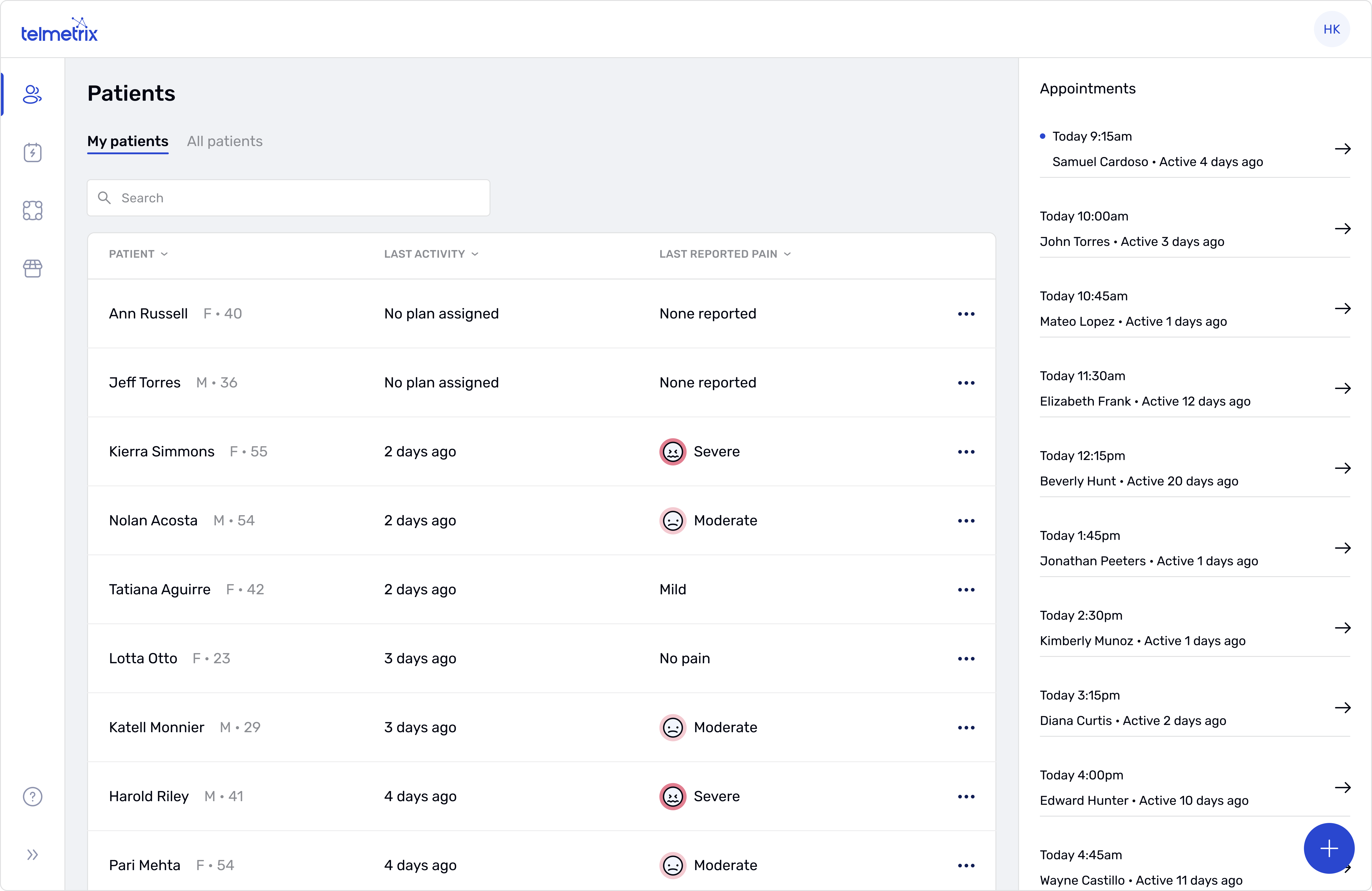
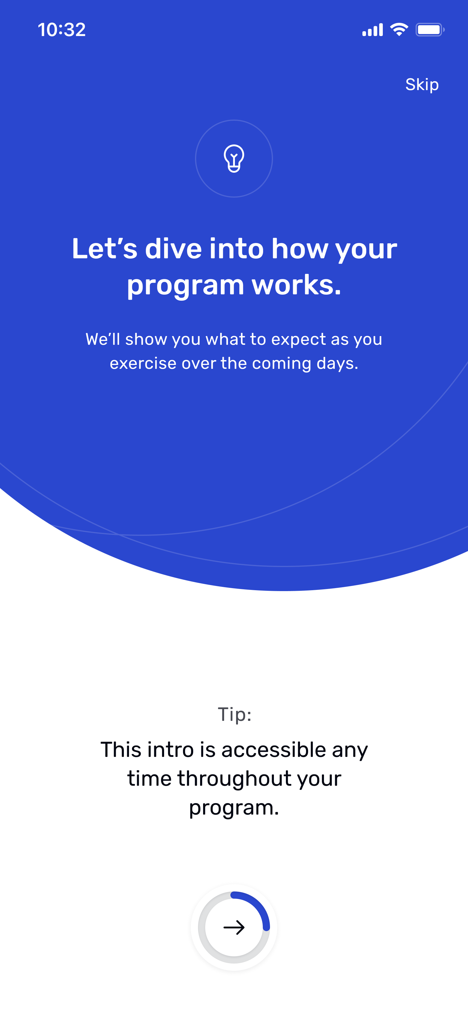
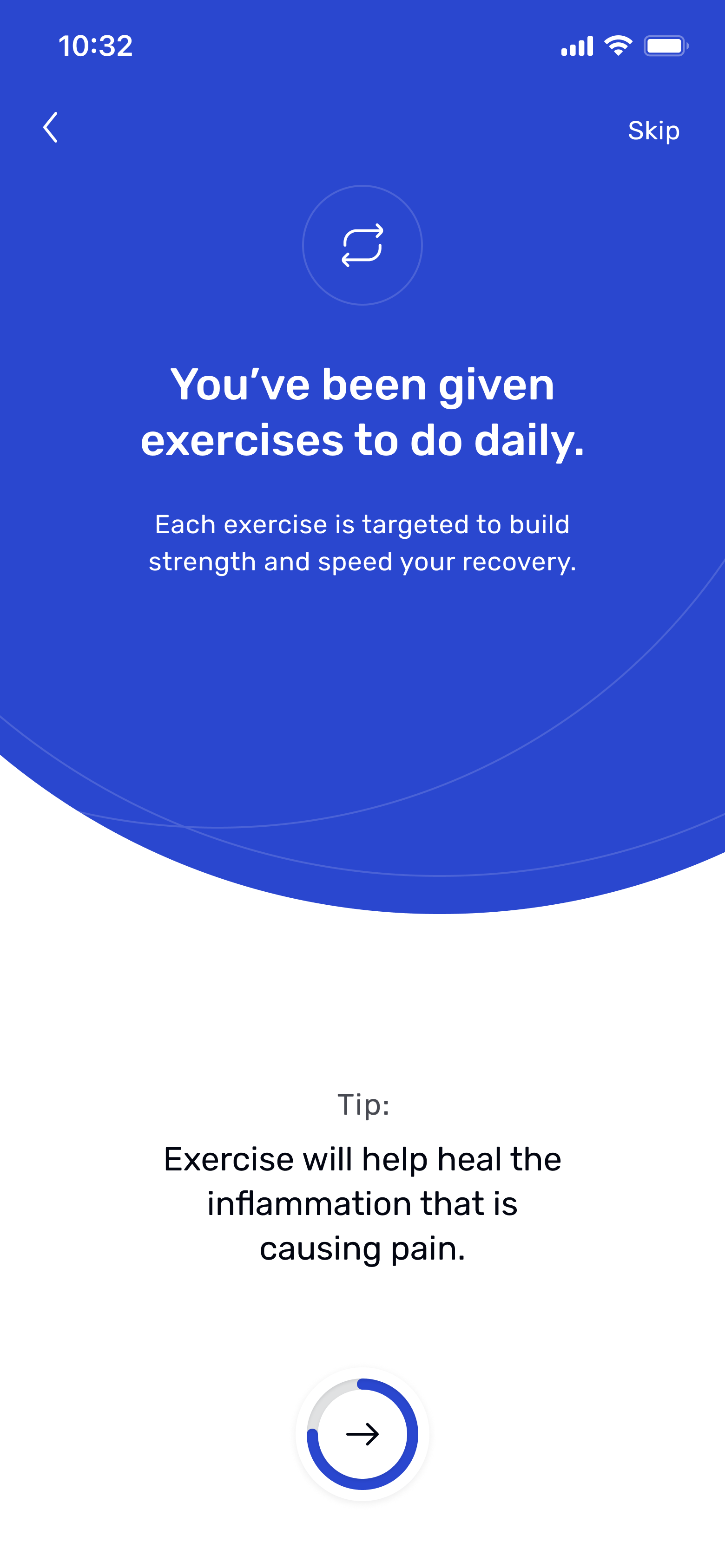
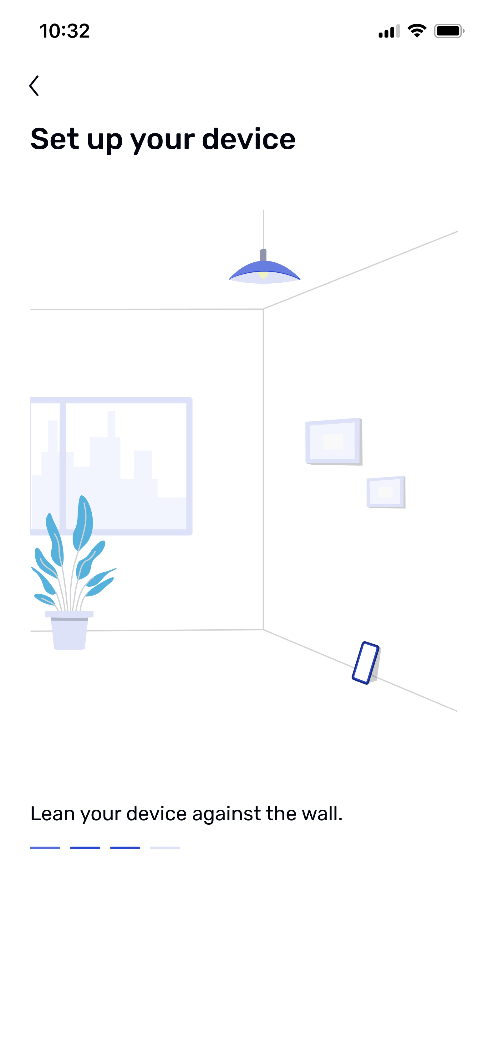
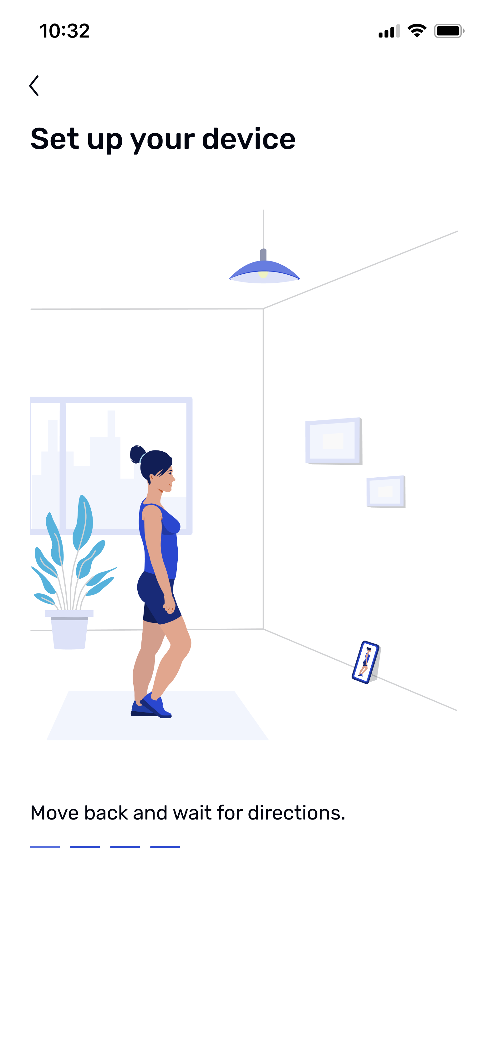
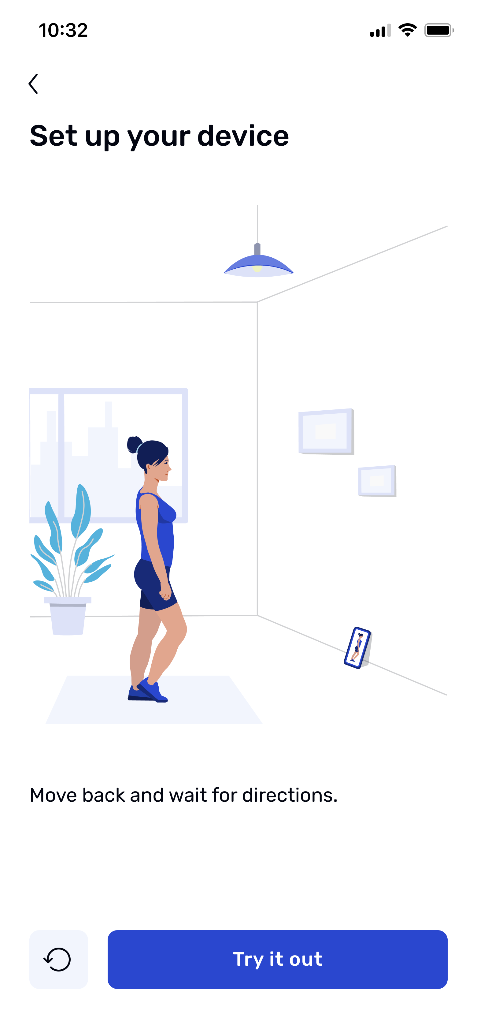
My plan was to focus the next phase of design on instilling confidence in the patient, followed by a phase dedicated to getting them up and running with the app through simple, clear direction.
I began the first phase by testing three different approaches to motivational content to see which resonated most with users:
1. Progress milestones:
Showing patients their projected progress week by week, paired with a simple visual timeline.
2. Success stories from similar patients
Displaying short testimonials from people with similar conditions who saw results by sticking with their exercises.
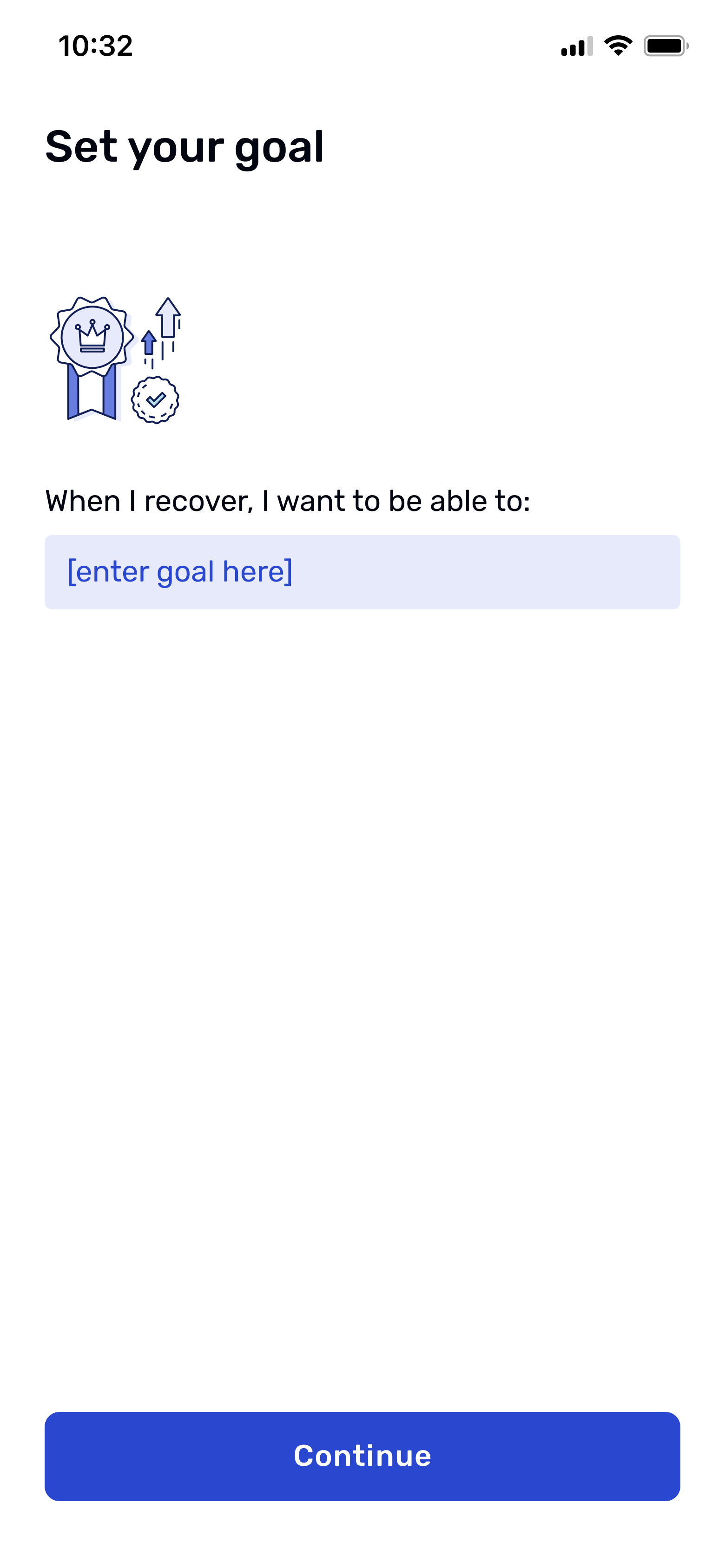
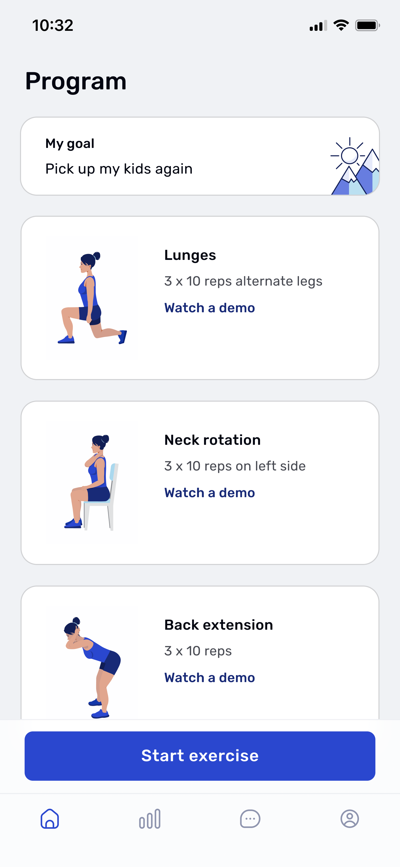
3. Goal-based motivation
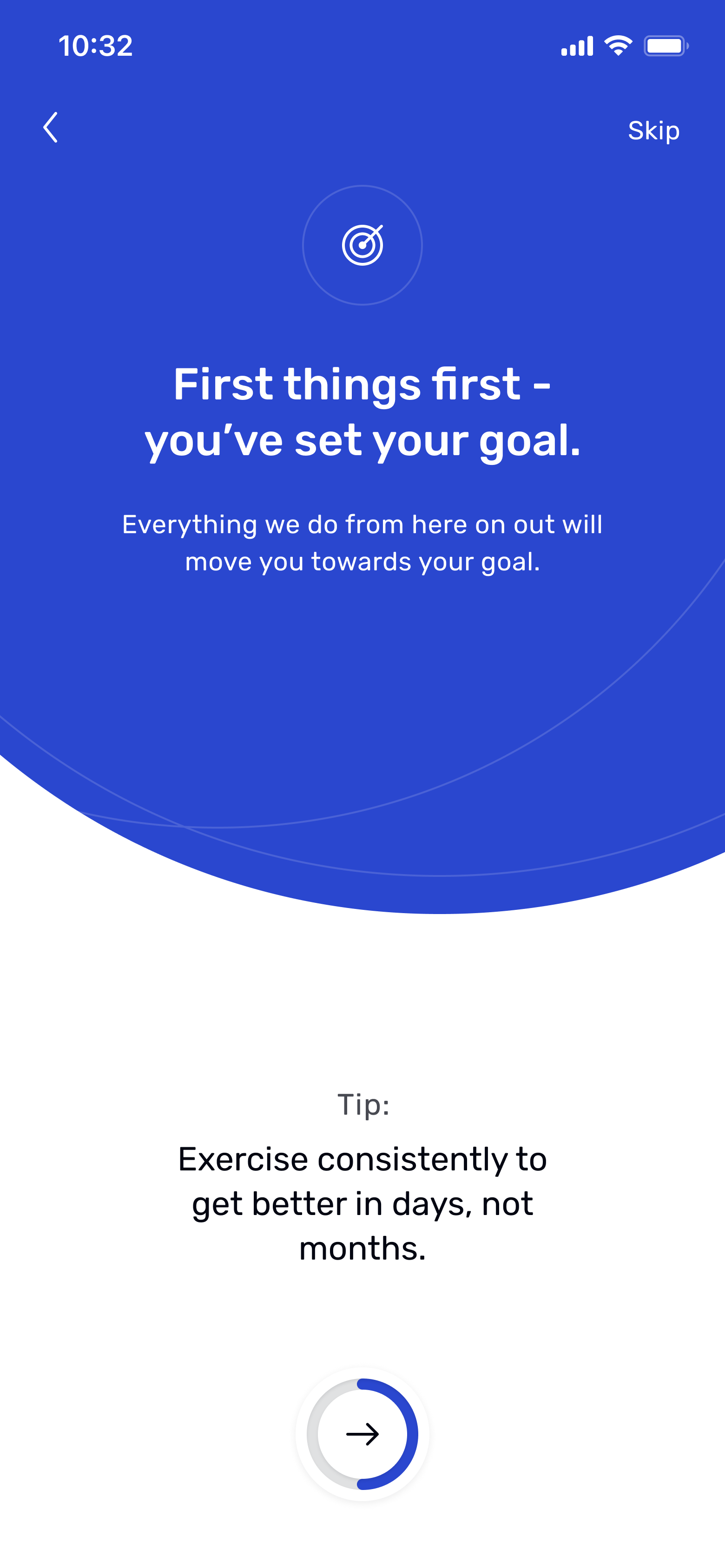
Letting patients set a personal goal, like lifting their child without pain or looking after their home again and do things like cleaning, cooking, and moving around freely. Something they could picture themselves doing but hadn’t been able to since their injury. Then explaining how the assigned exercises would help them reach that goal.
I tested these concepts with 12 users on UserTesting.com, aged 35 to 65, all of whom had prior experience with physical therapy. Most were either employed full-time or retired, with family responsibilities that influenced how they approached time and commitment.
The first two concepts failed to make a strong connection. The clinical milestones were too abstract, and the success stories felt impersonal and dismissible. In contrast, the goal-based concept made a true connection. 83% of testers reacted positively to the idea of working toward something that mattered to them. It gave them a reason to believe in the program and reframed the app as a tool for getting back to the life they wanted.
As one user put it, “It’s good to think about your goal while you’re in the most pain. So that as you’re getting better, you can be reminded of your goal. I like that they’re telling me why I set a goal and that the work I’m doing is all to reach my goal.”
Another said, “Okay, the experience that I just went through was positive and encouraging. And it’s telling me that if I complete this program and I do it properly, I’ll be better. So that is encouraging to me and makes me want to participate. Makes me want to reach my goals.”
With a clear direction established, I ran another round of user testing with 12 new participants to fine-tune content, comprehension, and placement.

Setting the Stage for Engagement

In the next phase of design, I addressed another significant failure of the original product: the complete lack of guidance for first-time users. They didn’t know how to position their phone, where to stand, or how to begin an exercise, which led to confusion, frustration, and immediate disengagement.
I created a prototype that opened with a short animation showing someone setting up their device in a real physical space. The demo clarified where to place the phone, how far to stand back, and what to expect next. By removing ambiguity at the start, the design was intended to give users a sense of confidence and control, both of which are essential for early success and long-term engagement.
I tested this flow with a similar user profile to the previous round: 12 adults aged 35 to 65 with prior physical therapy experience and varying time constraints.
Key results from the test included:
92% of users reported feeling confident that they could complete the setup after watching the animation.
84% rated the setup process as clear or very clear.
42% had to rewatch the animation at least once to fully understand the setup steps.
One participant explained it this way: “Ok, setup your device, make sure you’re in a well lit area with 6-8 feet of free space around you. Lean your device against the wall...I love the visuals that are appearing...move back and wait for the directions. This is really, really great. Again, for all types of learners, you still have that simplistic look to your app, but then you include visuals pertaining to the instructions. I totally applaud what you’re doing because it’s awesome. So I love it.”
The animation clearly succeeded in helping users understand the setup process and feel confident proceeding, reinforcing that it was the right instructional format. However, the number of users who had to rewatch it revealed an issue that needed to be addressed to optimize comprehension. In the next iteration, I slowed down some of the animation timing and added a replay button.

Protecting the Experience from a Technical Constraint

I now needed to add a step for the user to grant camera access. As I worked through this update, the development team surfaced a significant technical constraint: after permission was granted, the system could require up to 30 seconds to ready the device for motion tracking. This delay was necessary to initialize the camera, load detection models, and stabilize the environment for accurate sensing. While the pause couldn’t be eliminated, the challenge was to absorb it into the experience in a way that made sense to users and preserved their momentum.
To solve this, I framed camera access as a benefit to the user and presented the delay as a natural part of the flow. I designed a simple, focused screen that positioned camera access as the first step toward receiving real-time movement guidance. Once granted, an animated loader created a moment of visual engagement while the system prepared in the background. I timed this carefully so the loader transitioned directly into the setup demo, making the pause feel like a logical progression rather than a disruption.

What This Work Unlocked

This renewed focus on the in-home experience gave the product a credible path to sustaining patient engagement between clinic visits, directly supporting the business need for consistent appointment attendance. The goal-setting framework created a more personal and motivating entry point, while the setup flow established the clarity and confidence users needed to take the first step. Together, these elements transformed a previously disjointed experience into a guided, purpose-driven journey that strengthened user trust and laid the groundwork for long-term adherence.

Outcome

With growing pressure to show real-world results, the executive team moved forward with a clinic pilot even though the motion tracking technology was not yet ready. To keep momentum, the platform was temporarily adapted to let patients self-report their sets and reps instead of relying on automated tracking.
Despite the limitation, the impact was substantial. Over a 60-day period, patients using the platform showed a 42% increase in exercise engagement and a 55% reduction in appointment cancellations. Furthermore, clinicians saved an average of 7 hours per week through clinic-facing tooling and automation, opening up capacity for 6 additional patient appointments each week without increasing staff.
Still, it was clear that patient self-reporting wouldn’t scale. The manual input required too much effort and showed early signs of user fatigue. Long-term success depended on integrating motion tracking into the experience.
The company ultimately ran out of runway before it could close that gap. It was a legitimate effort with real traction, but like many early-stage startups, the outcome came down to timing and resources.
Thank you for reading.